
June 4th / Todays Post
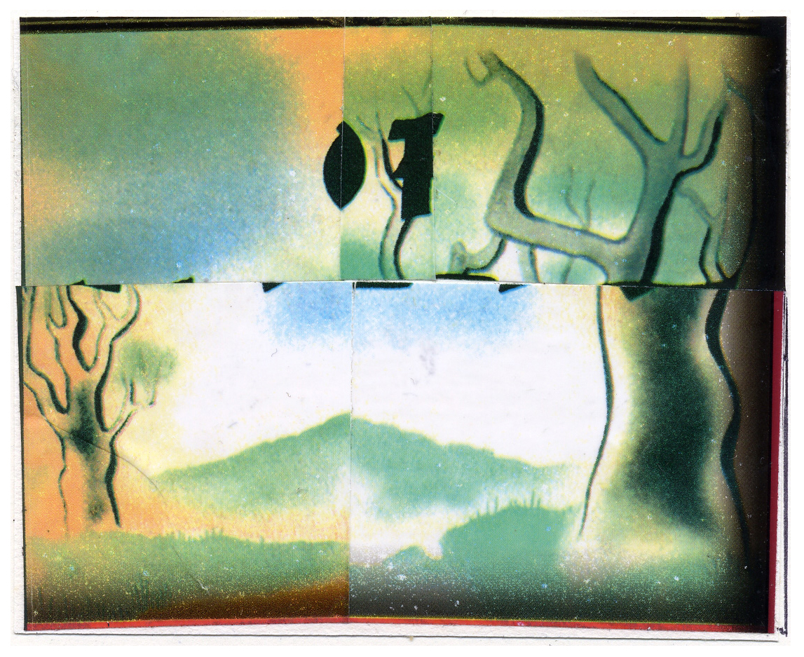
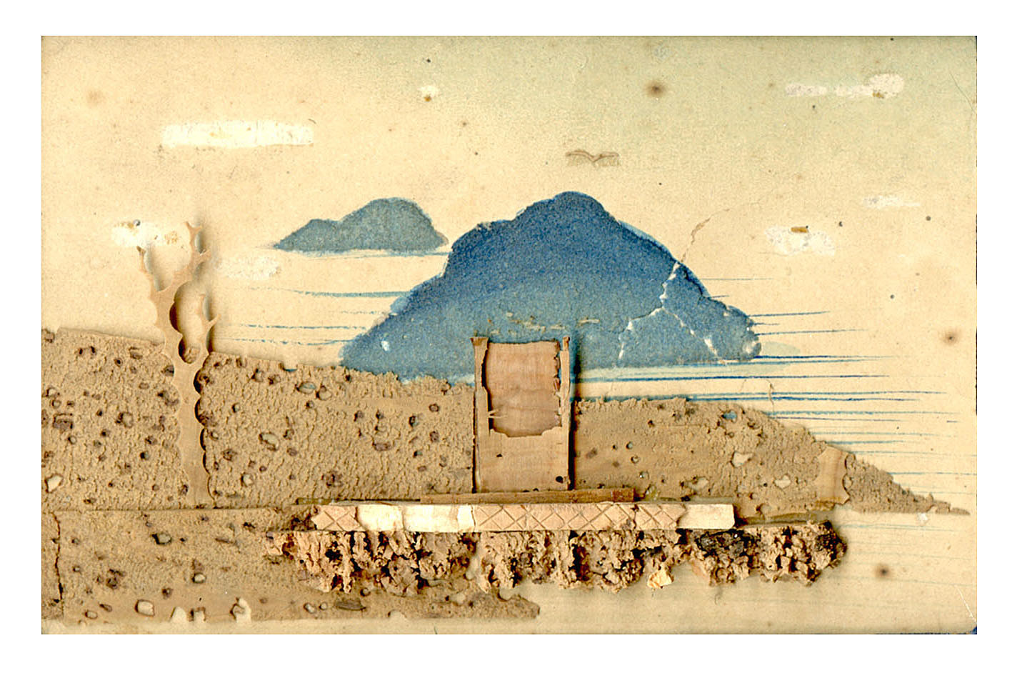
2005, collage made from a plastic Barnes and Noble bag that had an image of the original 1937 cover of John Steinbeck’s book,”Of Mice And Men” on it. The novella was set in 1930s California, but my interest in it was the period illustration; to extract the landscape rendering style to the exclusion of everything else.
May 28th / Todays Post(s)
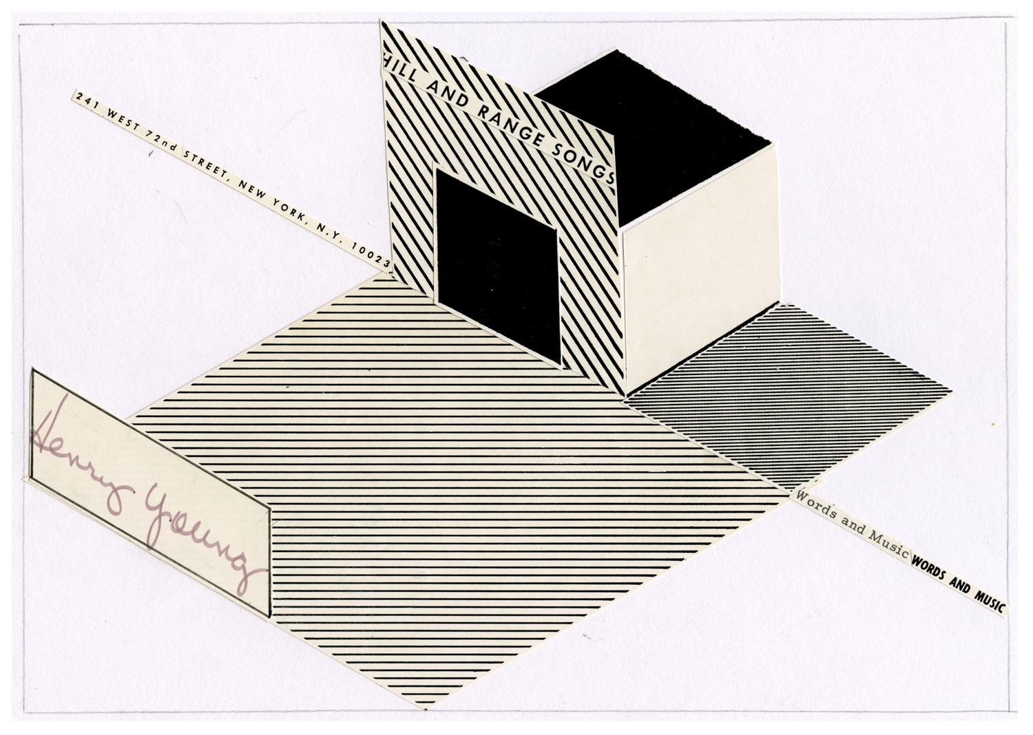
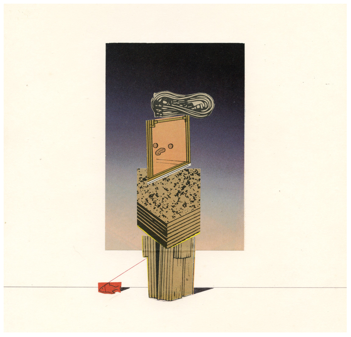
Top: “Redesign For Bygone Eras” series. 1955 sheet music cover (once belonging to a Henry Young) with typical diamond shapes, reworked as Early Modernist style collage, 2015. Below: 1983 collage, “Lady Walking A Fish”
May 20th / Todays Post
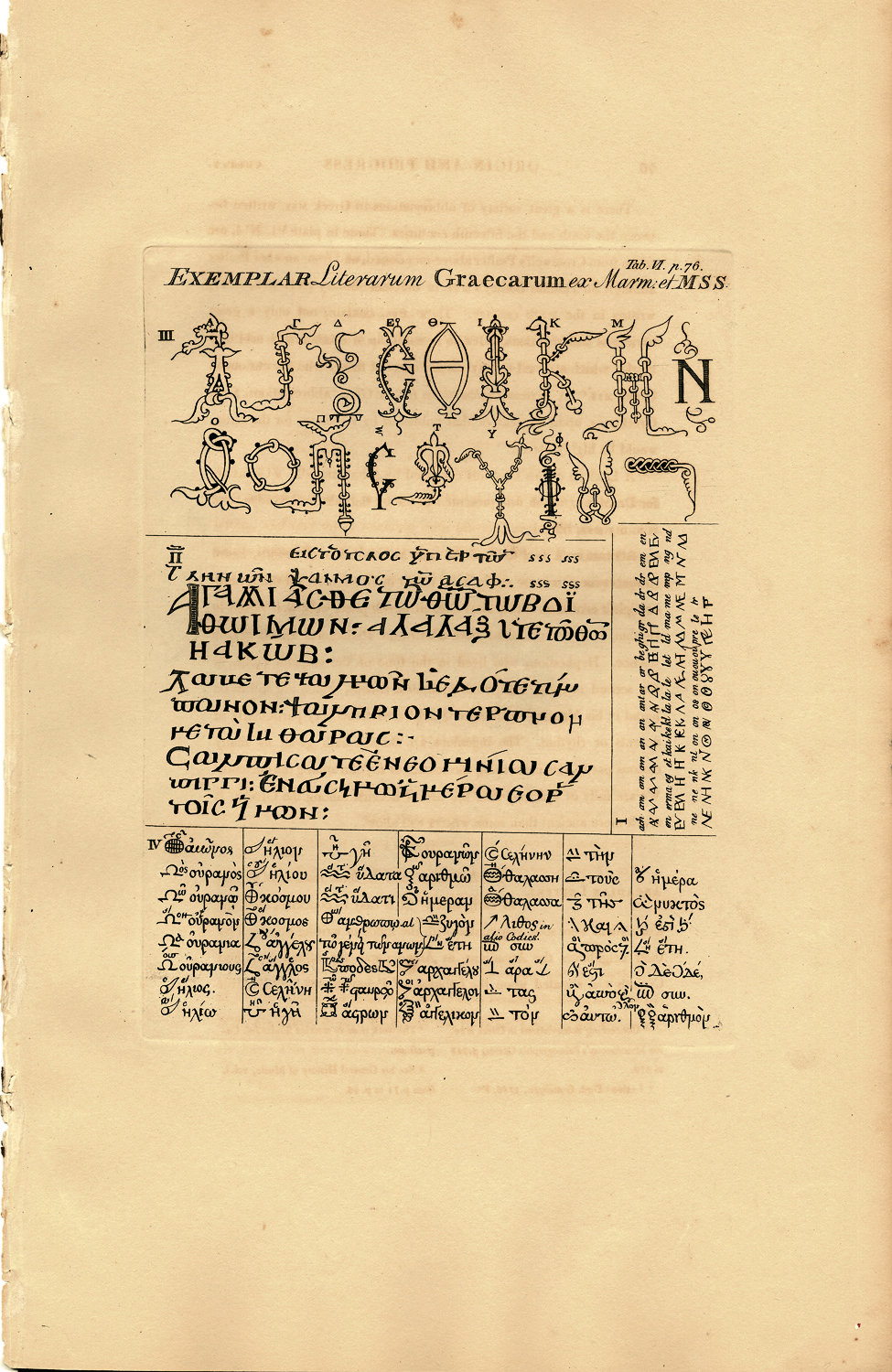
Page from an 1803 book on writing bought many years ago at the old Pageant Book & Print Shop on Houston Street in New York. At the time, I found this akin to my own hand drawn “flyers” project in both letter variance and form. Also, since no means of photographic reproduction yet existed in the early 19th century, any pages from the work of former eras had to be redrawn by hand and reproduced anew, giving them a particular charm now cherished.
May 18th / Todays Post
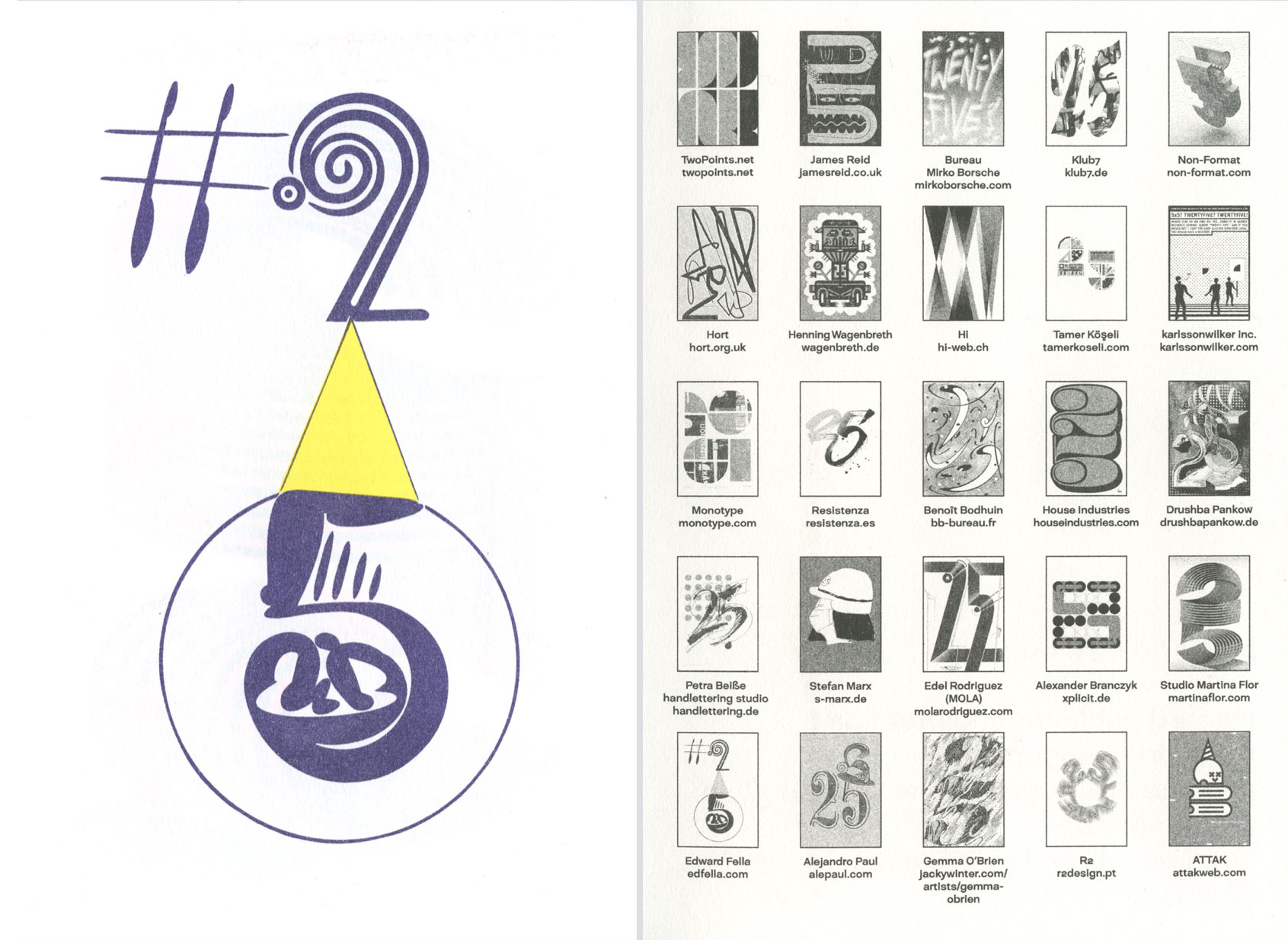
25 selected designers each did a page using the number 25. They were RISO printed as a little 2 color booklet included in the #25, 10th Anniversary issue of “Slanted” magazine (www.slanted.de). Here is mine.
March 14th / Todays Post(s)
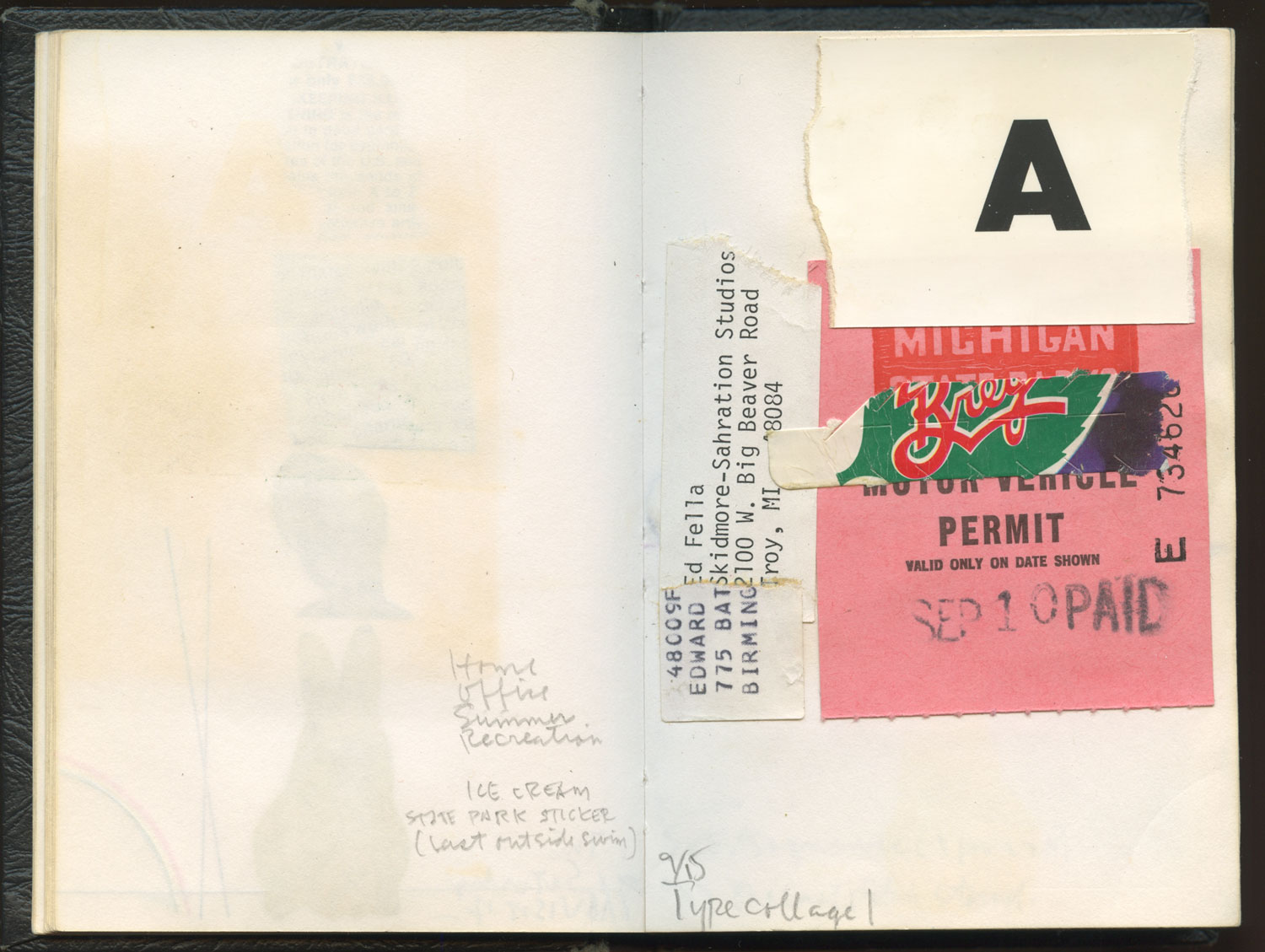
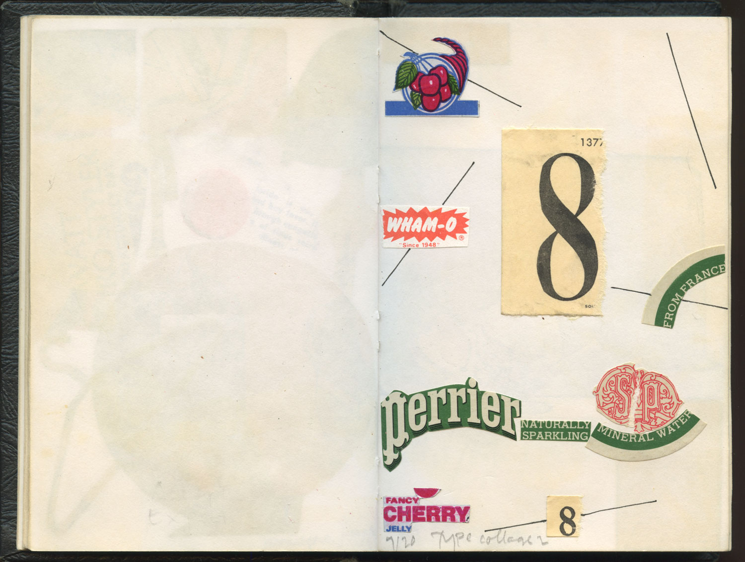
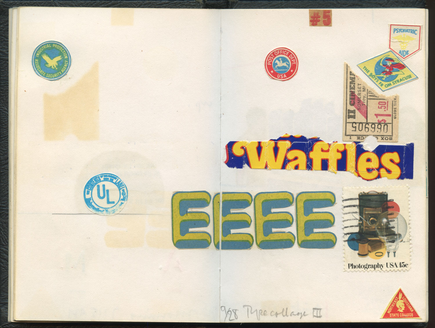
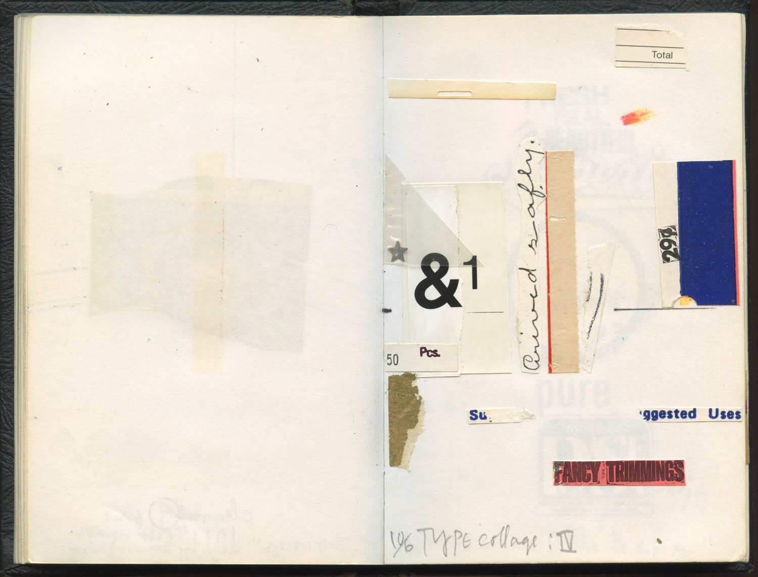
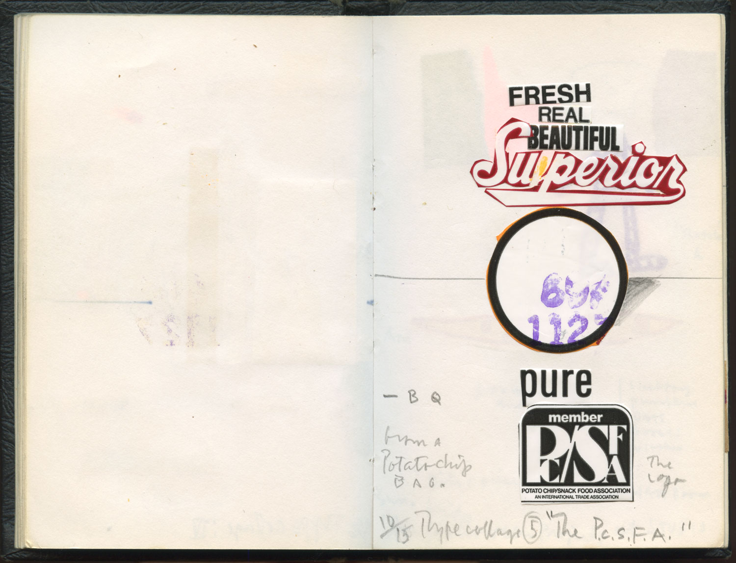
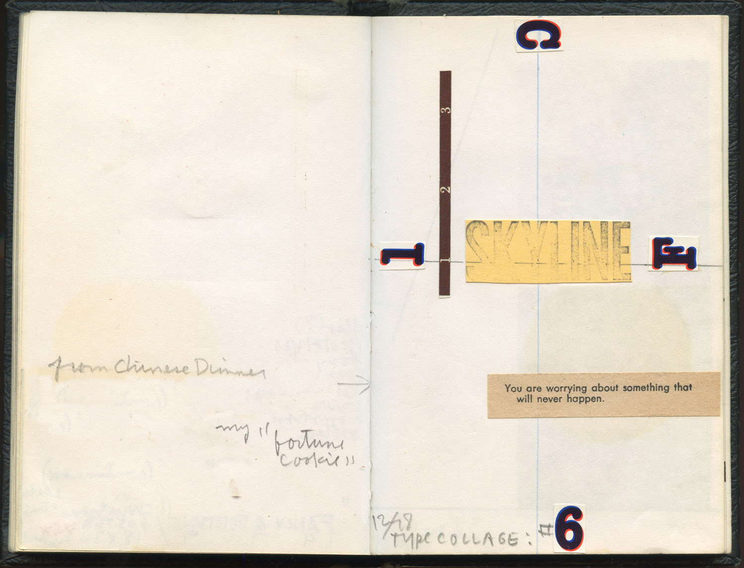
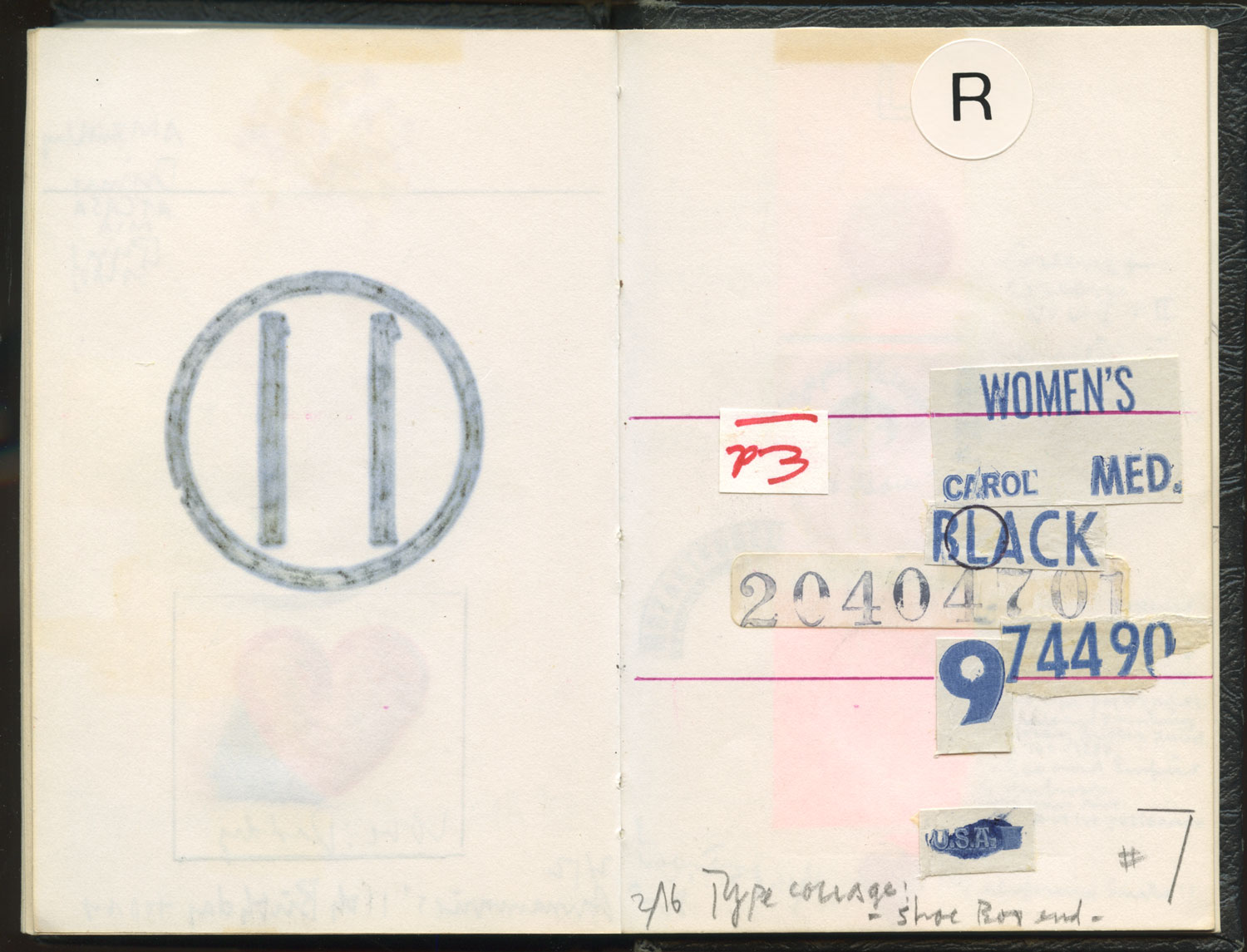
7 type collages from small sketch book, 1978. Looking back, these little exploratory paste-ups took me a long way into the next 3 decades of my typographic interests and work.
Mothers day / Todays Post(s)
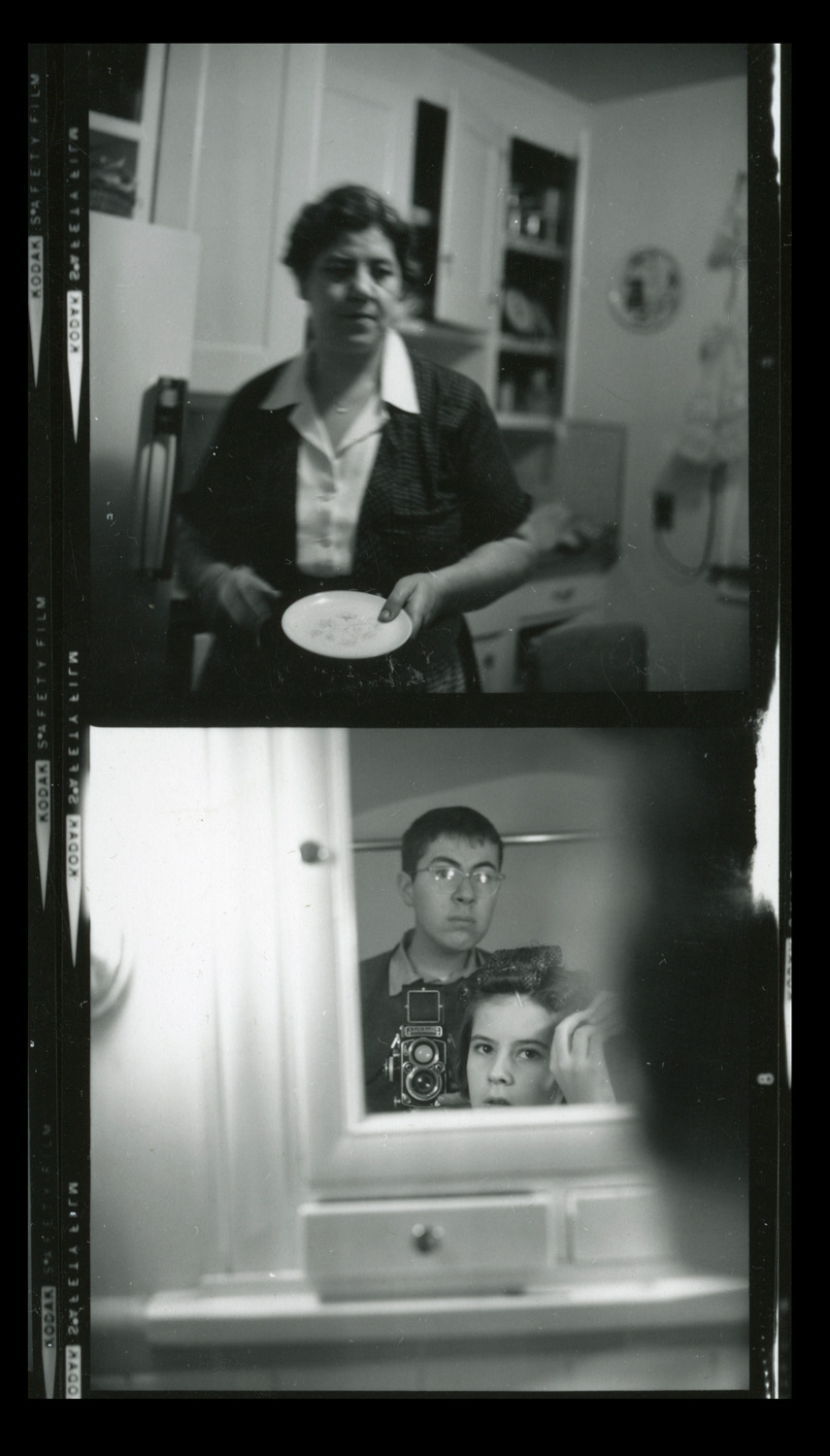
My mother (who bought me a Rollieflex Camera) and me and my little sister, 1961
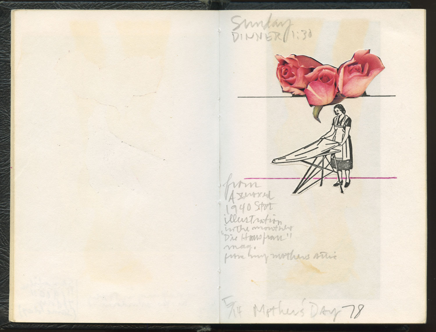
Small sketch book page, 1978
May 5th / Todays Post(s)
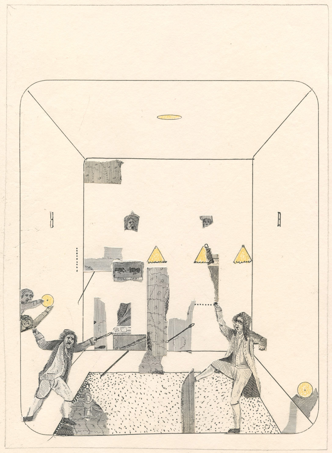
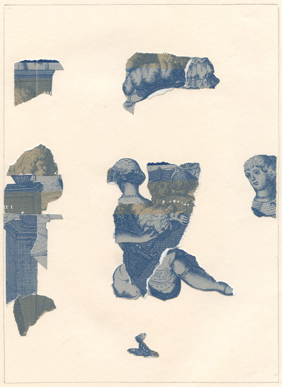
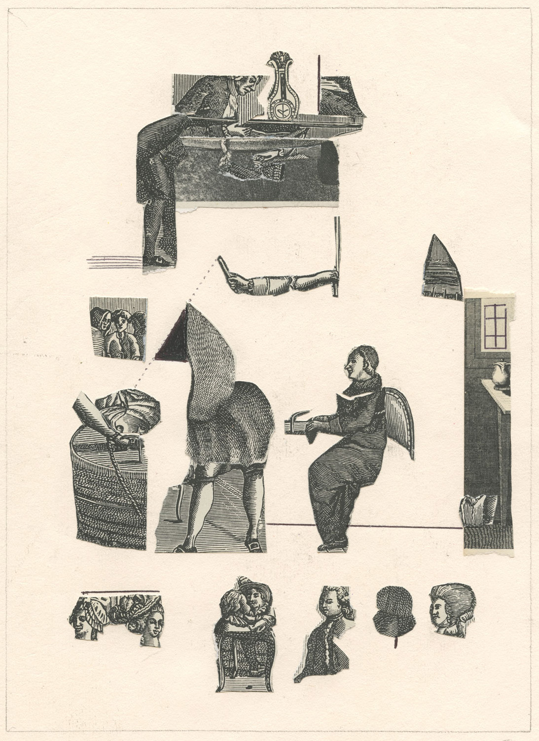
3 pages from a 2009 sketch book using (reproductions of) fragmented and rearranged old engravings telling obtuse little stories.
May Day / Todays Post(s)
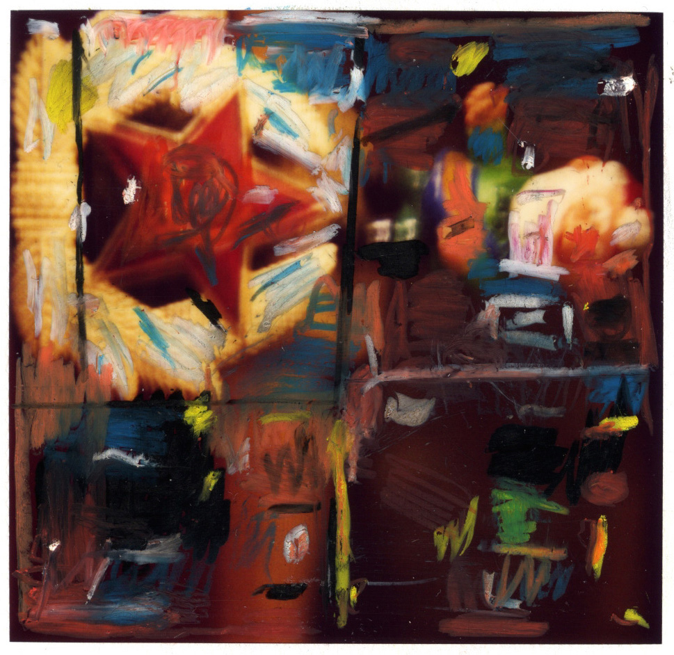
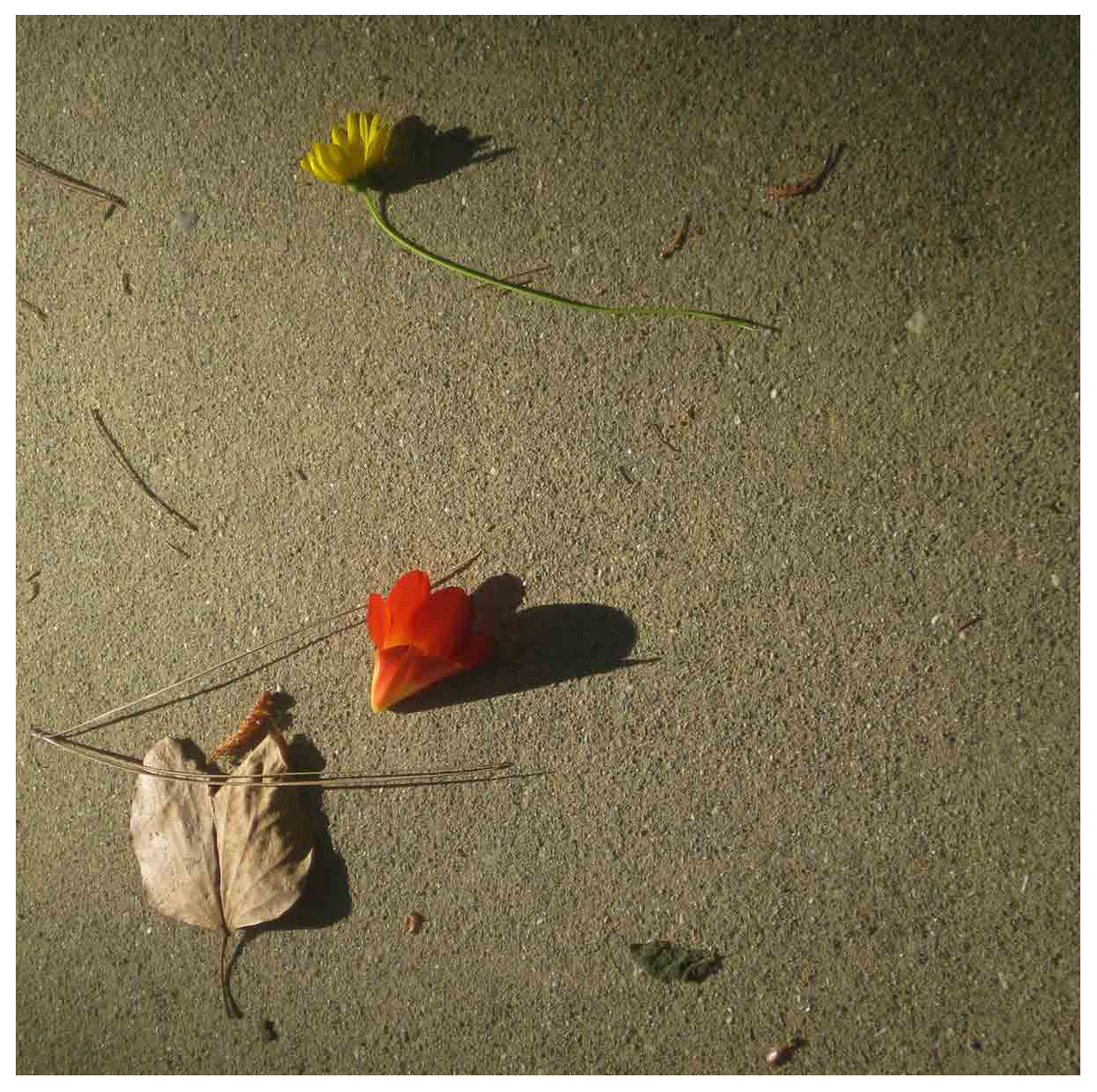
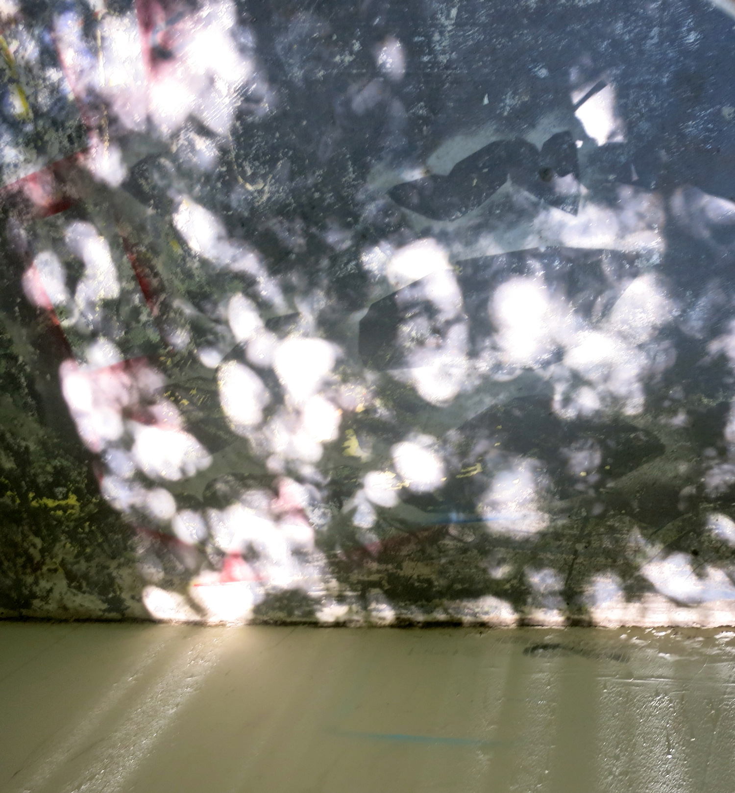
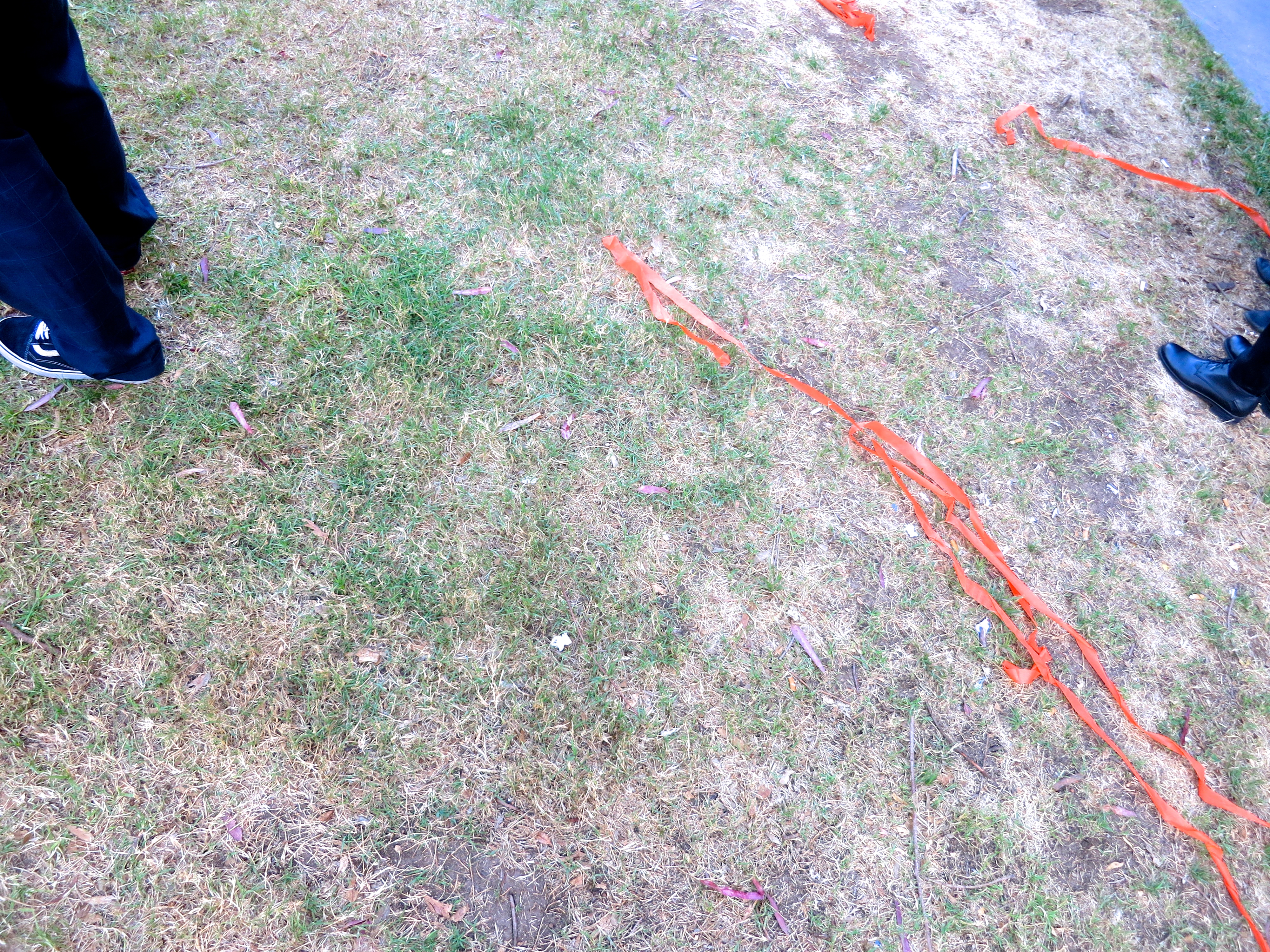
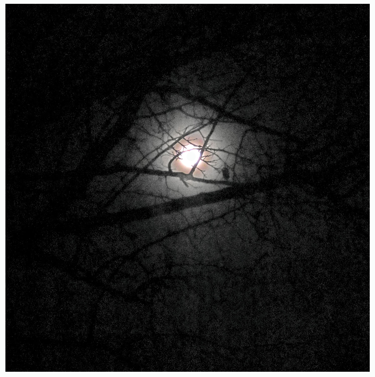
Top: Polaroid photo with grease pencil drawing, 2012. Bottom: Digital photo, found composition on walkway, 2014.
April 24th / Todays Post
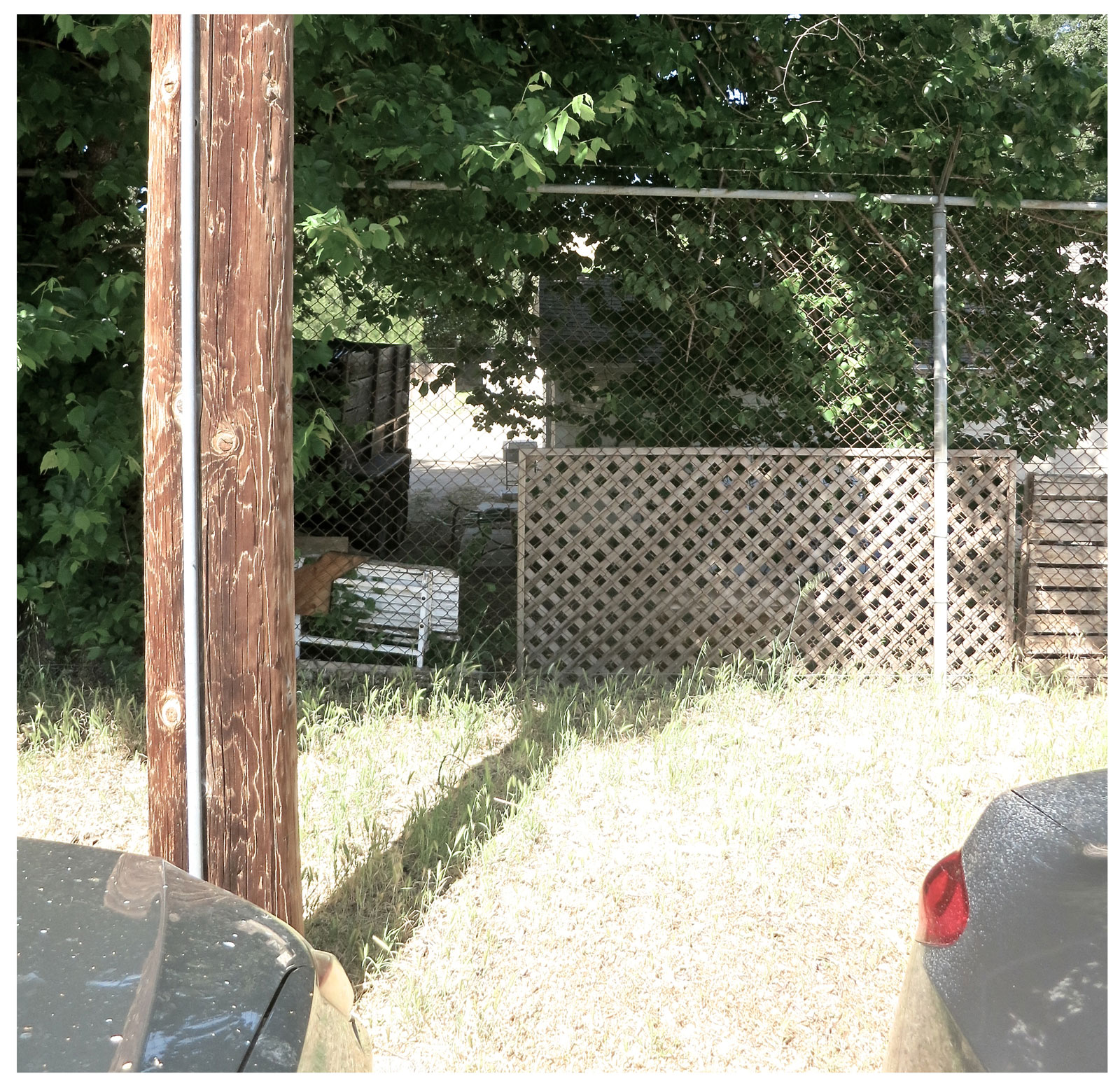
A perfectly bland photograph in California light in a geometric composition in the back of nothing in surely fronting something. . .aesthetic ?

April 15th Todays Post
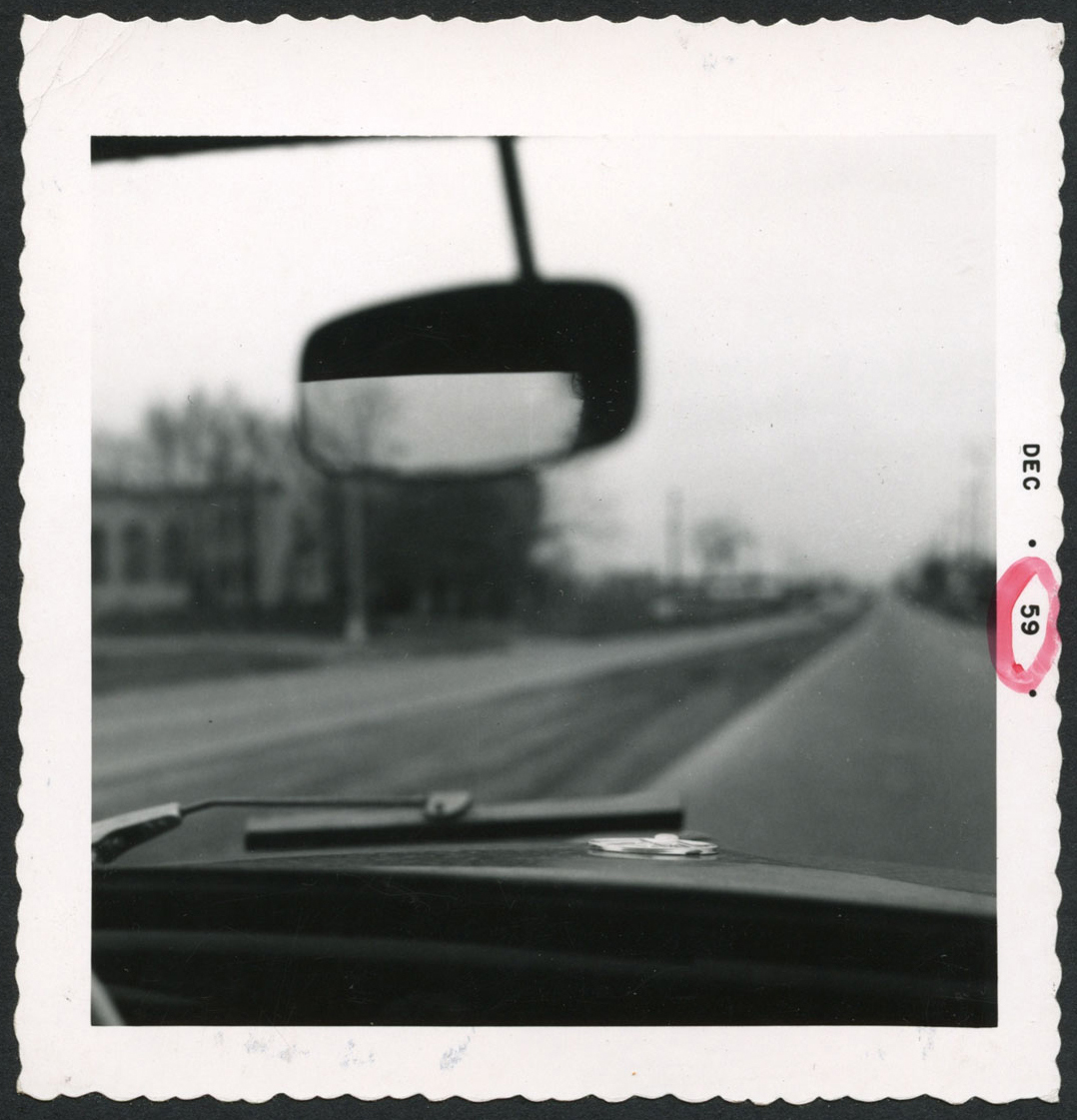
Through VW windshield, a Detroit snapshot, 1959.
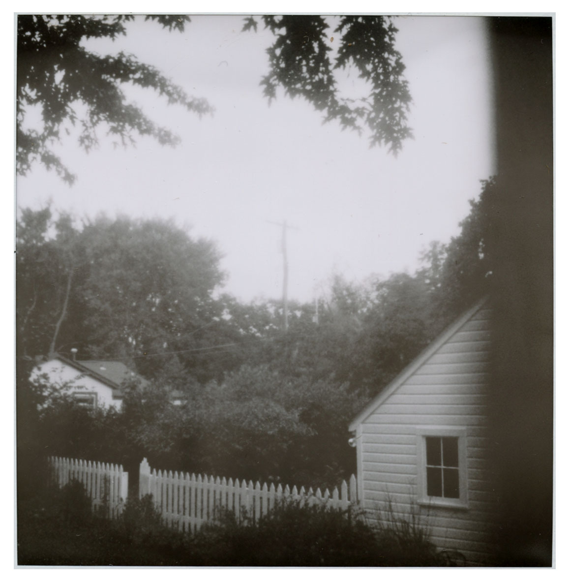
American Midwest, old B&W Polaroid photograph, Detroit, 2000
April 13th / Todays Post(s)
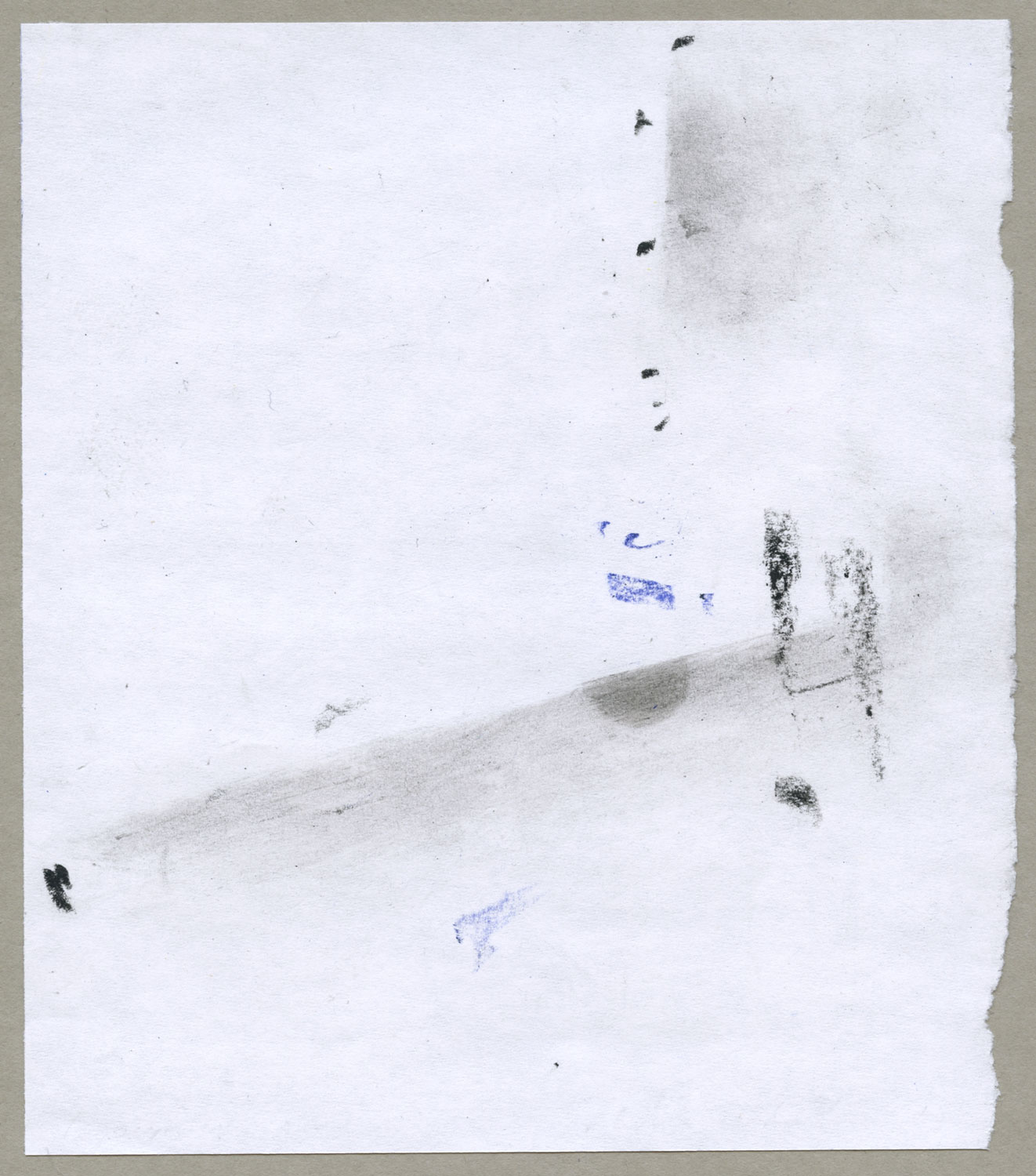
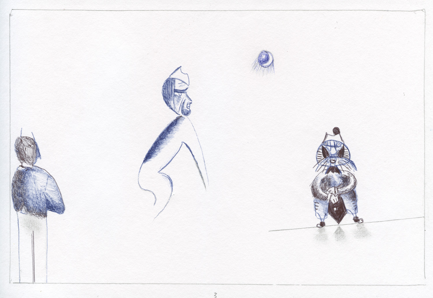
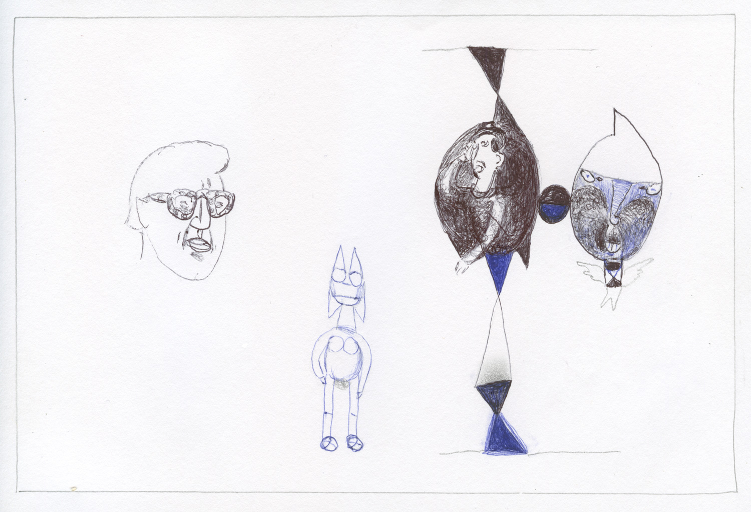
Tiny “found as is” drawing” from my trash basket, edited by cropping with an almost contemporary visual literacy.
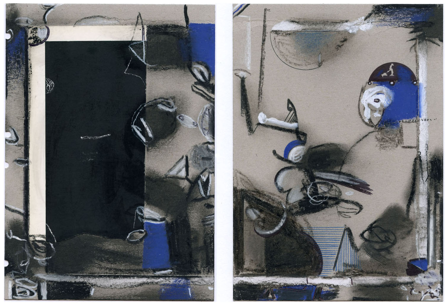
2 color stick drawings, 81/2 x 11 inches, on cheap rough card board. I could easily have done them in the 8os, but did them today as counter-factual history (mine).
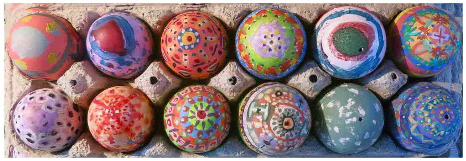
April 1st / Todays Post(s)
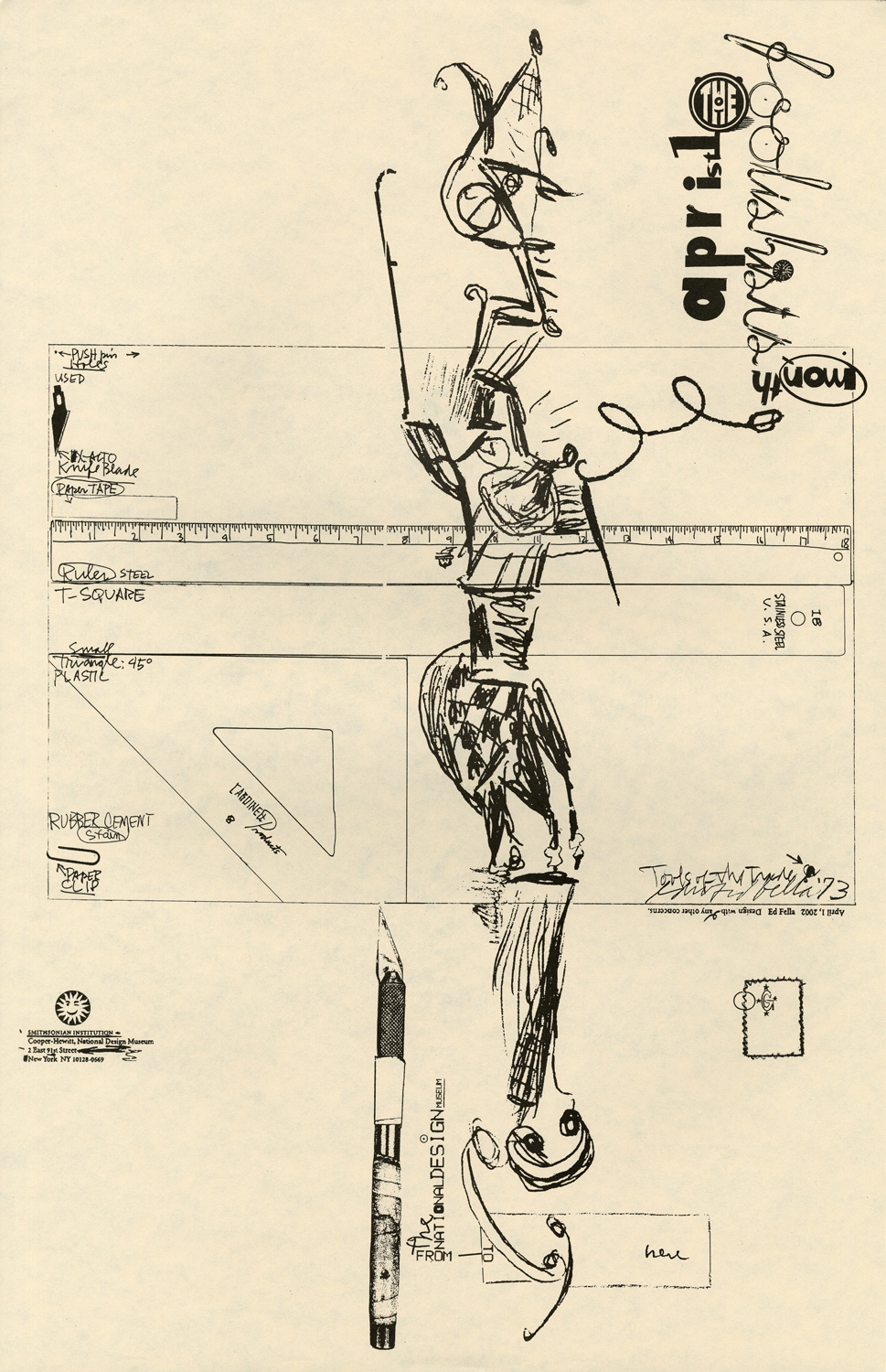
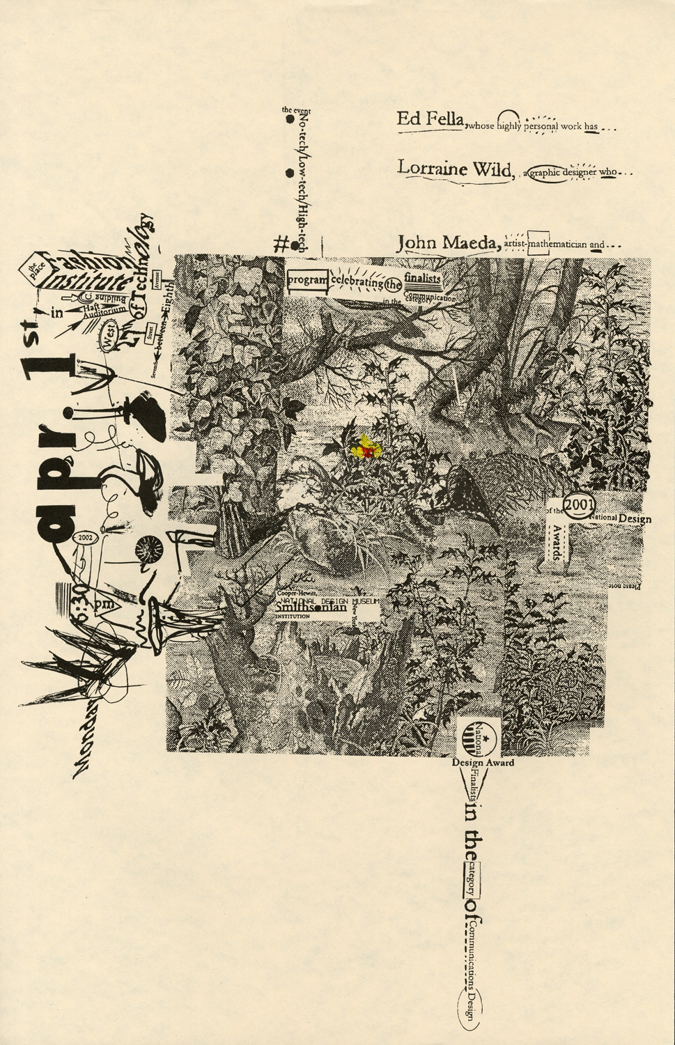
“After-The-Fact” flyer for a New York lecture by the 2002 National Design Awards finalists which happened to take place on April Fools Day. It was folded back to front, instead of front to back. Pretty lame, not much of a joke, but still, a passingly complex piece of work. But that’s me saying so, which might actually be an April Fools joke?
March 26th / Todays Post
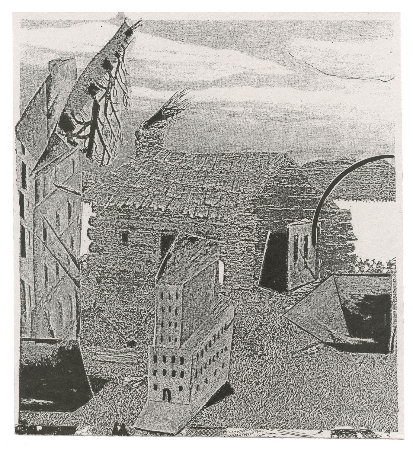
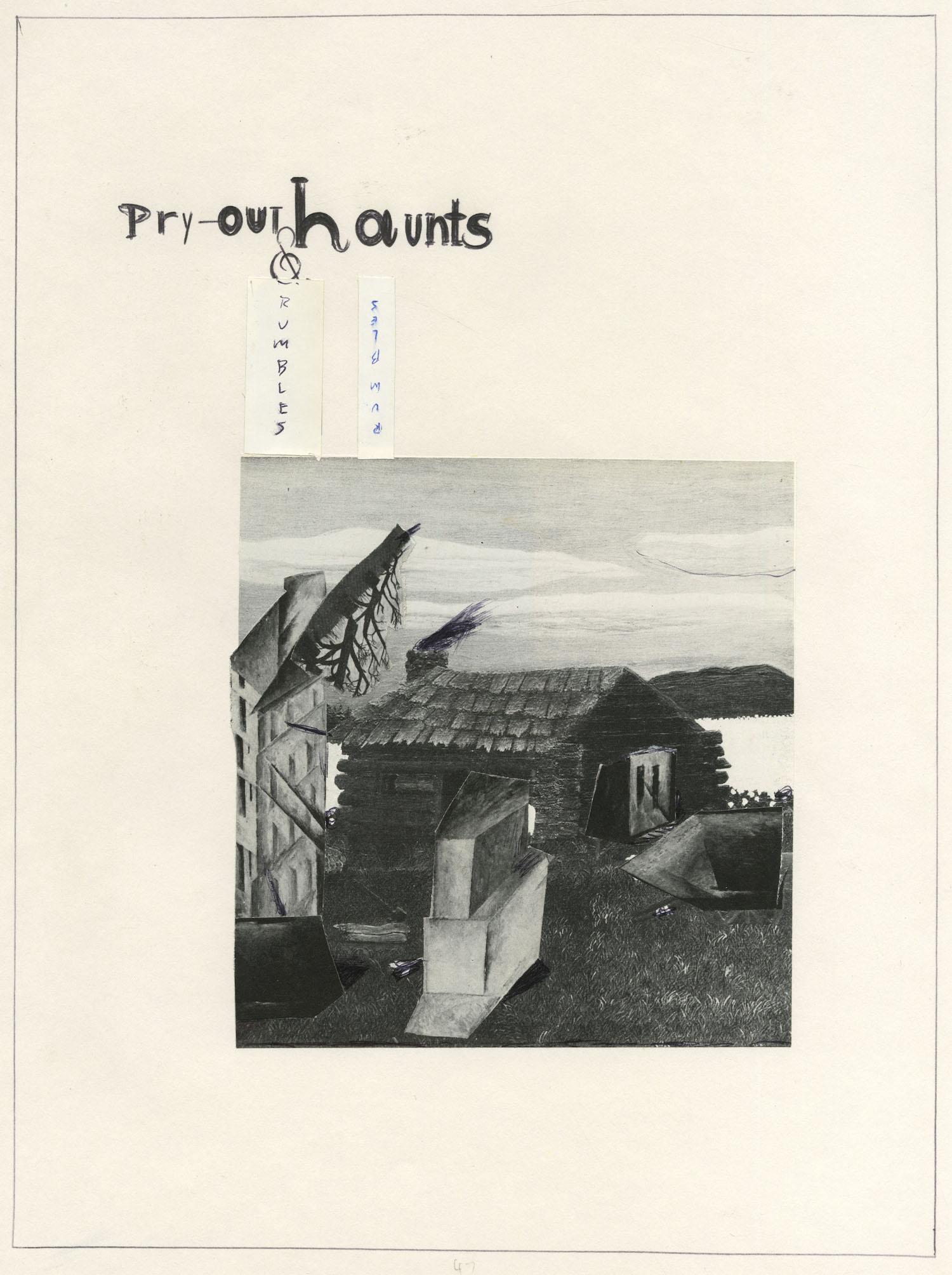
Xerox, offset printed, on gray bond paper, 2008. With additions from large sketch book page: lettering (“Pry-out Haunts & Rambles”) with collage, 1995.
march 19th / Todays Post(s)
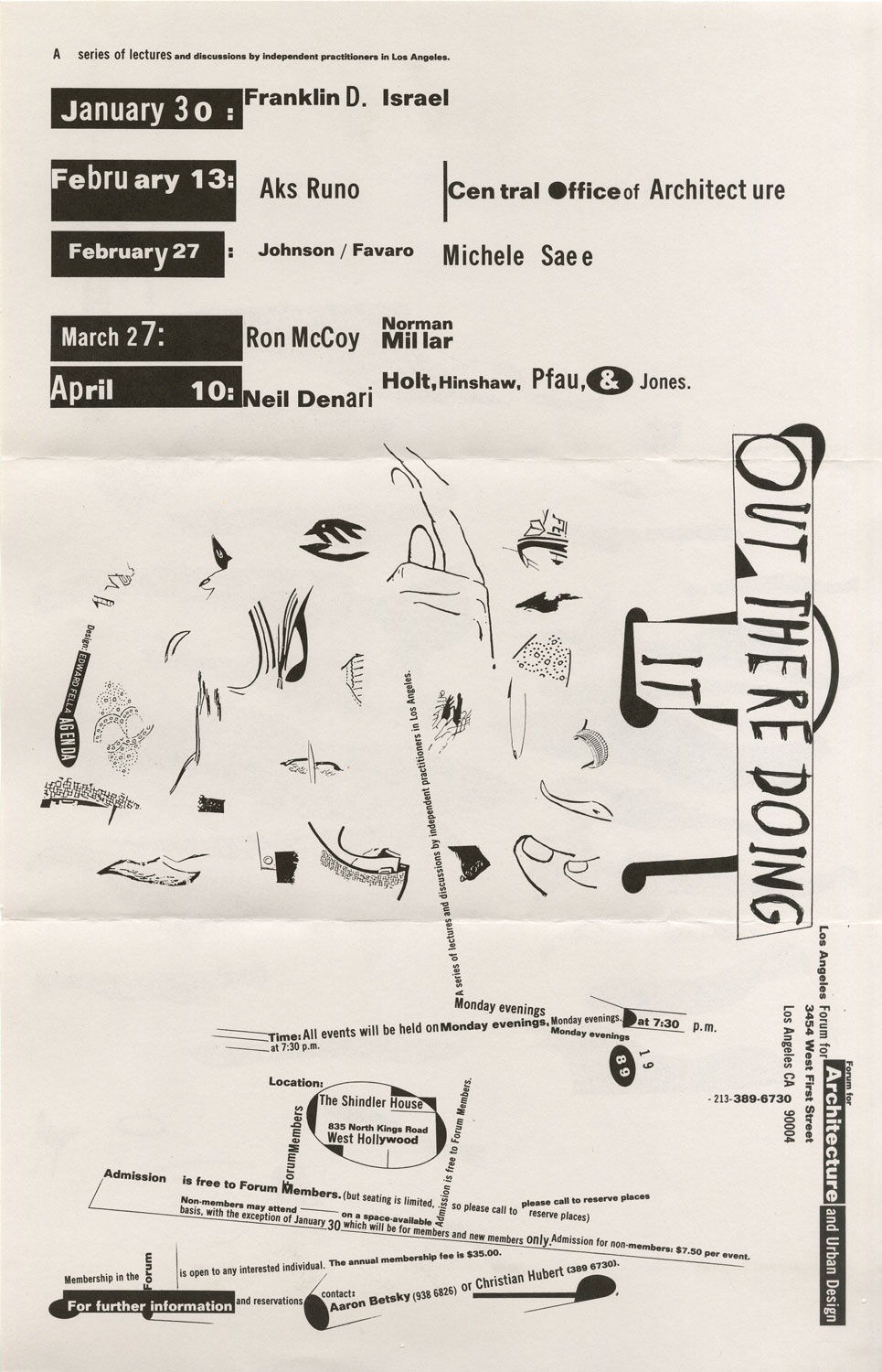
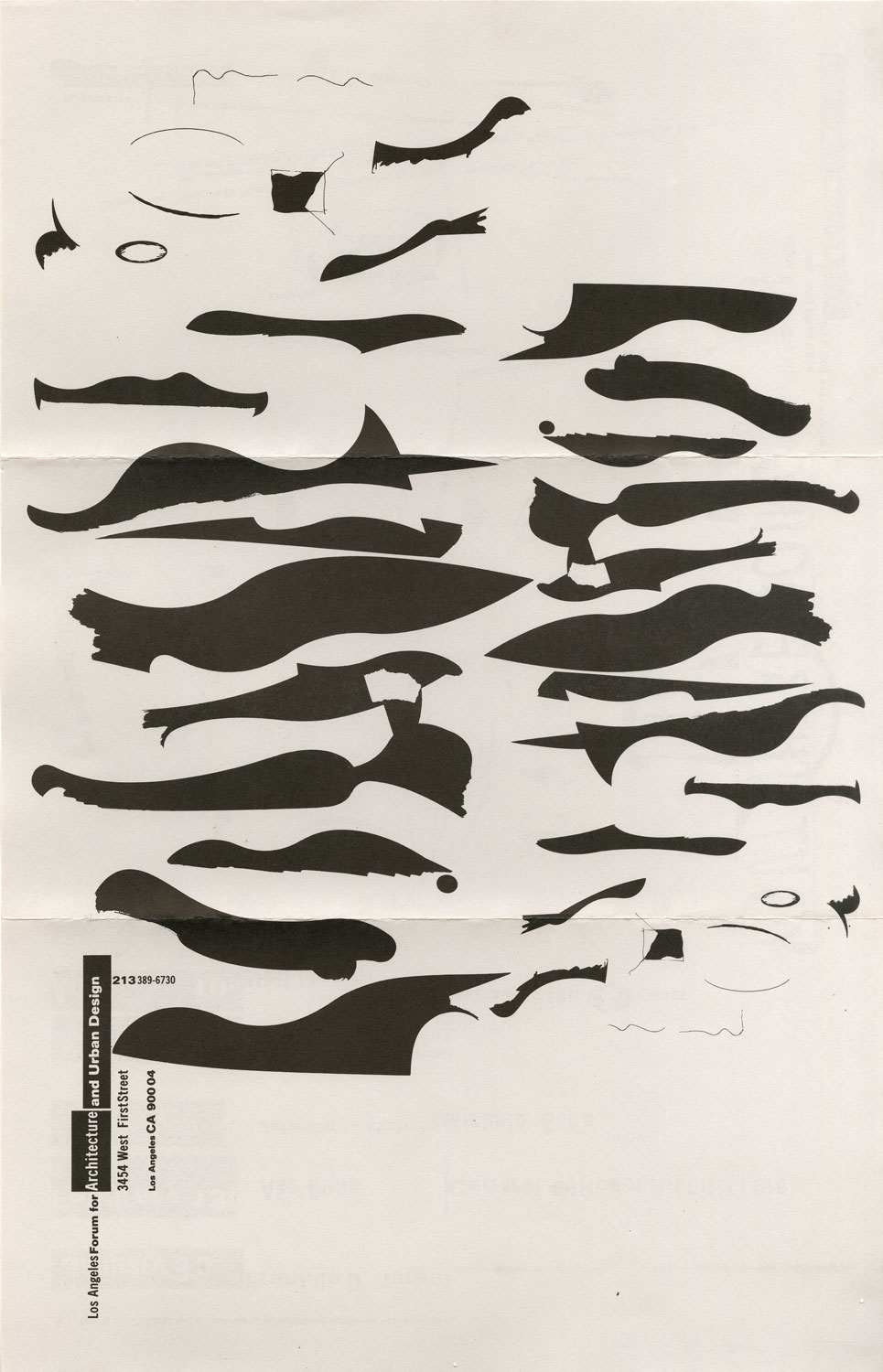
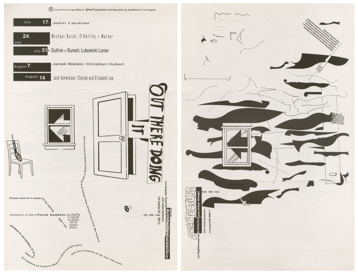
Top: front and back of a 1989 flyer, my first project in Los Angeles. This was to be the first of a set of three, announcing a lecture series by young radical architects on working in the real world: “Out There Doing It.” I divided the front, typographically into 3 parts, the top representing architects as structure, the middle is the fragmented reality of glitz and gelt, and the bottom, city streets and urban spaces mapped with information of venue locations. On the back are my fake “form studies,” beloved of architects, with the address and postal indicia on bottom. The flyer folds into 3 parts and is mailed as such. But, as was so often the case back in the late 80s, the typographic commentary was not appreciated, and the next series project was given to my studio mate Jeff Keedy for a more expected “Modernist” try. His “lesson” is below, the result couldn’t have been more explicit and the point was made brillantly! Needless to say, the designing of the third and final set disappeared from our studio, although our other partner, Lorraine Wild was to have had a chance at it. What a historic opportunity lost! In both cases our pieces were printed and used and the success of the lectures did not suffer from the postmodern shift in typographic expectations, nor has anything since… other than Jeff’s version, which is still remarkably prescient of some current 21st century stylistic attitudes.